ICM, Wk 1: Oh hi, p5.js
So here we are, the start of the semester. The start of GRADUATE SCHOOL. Holy sh*t. Five years out and I’m finally back in. The teacher becomes the student once again.
One of the classes I’ve been most excited to take is ICM (Intro to Computational Media, for all those non-ITPers). It was my understanding/expectation that this was the programming class, but not just regular programming – artistic, creative, experimental programming! Because ITP is a mix of all those things. I heard we got into Processing, which I learned a bit of in a coursera class about a year ago (never finished, but made a few sweet small illustrations).
Due to some social sleuthing, I found out from a resident that we were switching to a NEW program this year – this so-called p5.js. “New new, blah blah, things are probably going to be nuts so you should check it out beforehand.” So I took his advice and watched a funny video that featured Lauren and Shiffman (before I really knew who they were). I particularly liked the part where Shiffman said “See you later!” and then I found out that he taught at ITP and saw him at Orientation…a couple of days later.
So, ICM was the first class I had. I really enjoyed the exercise we did – creating instructions for a drawing and making a drawing from someone else’s set of instructions. The exercise reminded me of that old conceptual art boss, Sol LeWitt.
For those who are unfamiliar, Sol Le Witt was a conceptual artist from the 1970s who had a series known as the Wall Drawings. The idea behind the wall drawings was that LeWitt would write up a set of instructions and give them to people to execute as large drawings on a wall surface. Some were very specific, others left room to interpretation.
So when we got the assignment, I immediately thought of LeWitt. I also thought, wouldn’t it be funny to try and process a set of LeWitt wall drawing instructions into p5? Almost like a game of artistic telephone. I interpret LeWitt’s instructions and then turn them into code AKA a set of instructions for the computer to then interpret.
So I grabbed Instructions (1971)
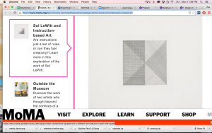
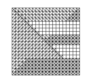
Which a version of at the MoMA is interpreted like this:

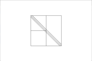
I was easily able to make a rectangle, and rectangles inside of it. But when it came to plotting lines, I quickly became frustratingly inept at getting it to place them where I thought they should go. My brain could not for the life intuit/understand this grid system. this led to grumblings and comparisons of analogue vs digital, a WHY CAN’T I JUST DRAW IT MYSELF. I turned to classmate Paula and using some basic math and trial and error, we figured out how to get my line where it needed to go.
I then looked back at the instructions and realized I mis-interpreted some of them, so went back to the drawing board (heh heh).
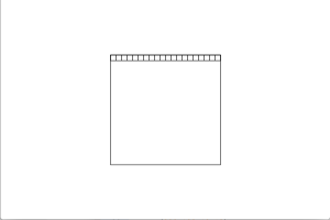
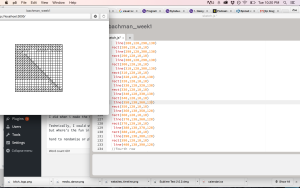
First I started by creating a 200x200px square (to correspond to the 20’x20′ square) on a 400x600px canvas.
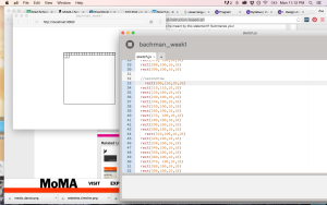
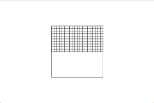
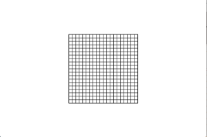
Then, in order to preserve the ratio in the instructions, I made squares 10x10px inside of the larger 200x200px square. 200 individual lines of coded squares. Let’s just say copy and paste saved me. First I created the entire first row, copy and pasted that for my second row, then figured out which parts I needed to modify. I continued that for the next 10 rows.
I then copied the code for the first half of squares and pasted it to create the next 10 rows, for a total of 20.
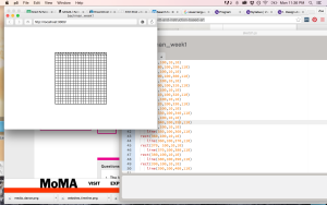
Next, I followed the next set of instructions and decided where to put my diagonal lines. Since all the rectangles have coordinates, I tried to match them up to create lines in a few of the boxes.
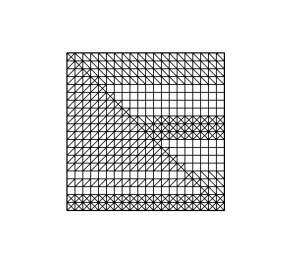
Now, this is where I started to struggle. Was I really going to write out each line of code for each line? I mean, sometimes I wanted two lines in each square aaaand that could mean up to 400 lines of…lines >< So I tried to organize my code to better copy and paste, but this was pretty difficult at times because I didn't have a chunk of code like I did when i made the squares. So, I divided the square in half along the diagonal, and decided to the left I would have diagonal lines going from bottom to top and to the right I would have them go top to bottom.
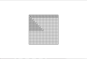
At some point I decided I’d have intersecting lines as the main diagonal line that bisects the large square.
Then at another point, I decided I wanted more intersecting lines than just that, so started to add lines of code to some of the bottom rows.
Initially, I didn’t want to use any blank squares. But as I proceeded in a somewhat randomized fashioned, I noticed that I liked some of the white areas I had left unintentionally. In general, it was difficult to be spontaneous with this and while LeWitt’s instructions leave an openness to randomization, my artistic-minded self wanted more of an intentional composition.
This artist-minded self proved difficult when my brain started getting tired and I would copy and paste the wrong code and have to redo it all. I mean, because it didn’t fit my intended composition. (I wonder what it would have looked like had I left my mistaken code…?)
What I found most interesting about such an iterative process was how meditative it became, and that I got into that same zone I do when I’m drawing. Although, this was after a few times when I just wanted to gouge my eyes out form starting at all these line and rectangle codes and the palms of my hands got sweaty from continually touching my laptop.
In the end, while I originally anticipated filling in every square, I liked the emerging composition that included the blank spaces (cue TSwift), giving it a weaving effect. So, I decided to stop there.
All in all, I find the concept of riffing off of other’s work very interesting. You can expand or subvert the very intentions of an artist by using their work in a new way or putting it in a new context. It also gives a specific context to a new piece, situating the new work in a certain language and history.
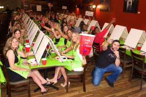
I’m also interested in the idea of instructional-based art and the nuances and interpretations that can occur, even when someone tries to stick closely to the model. Makes me think of happy-trees painter, Bob Ross and his show, The Joy of Painting on PBS or the kids version that I used to watch as a kid, Pappyland. Ditto paint-by-numbers or that new phenomenon, Paint Nite.
Like I said before, it’s sort of like a visual game of Telephone. But I wonder how often that’s due to human error and that if using machine-based drawing systems for a Paint Nite would lead to everyone’s painting’s looking exactly the same, or if the organizers would intentionally leave opportunities for conditional statements.
PS – The New Inquiry’s latest issue on Counterfeit informed and expanded some of these thoughts.
PPS – Here is a song by the Beatle-ette’s, a rip-off/riff on the Beatles that I think treads an interesting line that sort-of also speaks to these ideas.


Pingback: Sound and Vid, Wk 1 – Response to Readings | itp blog