Pcomp, Wk 3: Blog Post – Interactive Technologies
I think…I think I’m still figuring out exactly what interactive technology is.
Like Crawford says, it can exist along a spectrum. You initiate an action, an object responds, etc. So what, exactly, could qualify for this assignment?
Honestly, the first piece of technology that I find myself continually having frustrating interactions with is those credit card machines. You know the ones I’m talking about? They seem to predominate at grocery stores and pharmacies, though I saw one at Blick the other day.

My main point of irritation with this piece of technology is that it is inconsistent. I use a debit/credit card, so when I make purchases I have to specify whether the card should be used as debit or credit. For some reason, even those these machines do the exact same thing, they do it in different ways. So some machines default to debit and then I have to hit a red ‘CANCEL’ button in order to proceed as a credit transaction. However, other designs have you press the green ‘ACCEPT’ button in order to use credit. Still, others have an on-screen option. Sometimes you press that option beforehand and then STILL have to cancel the transaction. Every time I use one of these things it feels like I have to do something different.
Even worse, especially at pharmacies for some reason, there are intermediate screens. do you want to donate $5 to cancer? Oh god, please don’t guilt trip me while I’m trying to buy tampons. I just want my tampons. Also, just an irritant on the way to my anxiety over whether I press red or green on the next screen. I can’t tell you how many conversations I’ve had with cashiers asking which button to press because every time I think I know, I press the wrong one. So I always check from now on, even if they give me weird looks and I always say, “Hey, it’s different at every single place!”
So in Design of Everyday Things, Norman talks about visuals and concepts. How do we conceptualize the step of running a card and changing the type of card? Are we automatically assuming it’s debit and thus have to nullify the transaction? Or is our logic that it must be credit and so we accept it? The colors correspond with whichever choice the machine thinks is most logical in that moment.
Also, those pens that you have to sign with. Why are they always on the left-hand side? Aren’t most people right-handed? And why do they have cradles that never actually fit the pen? I’ve seen so many people struggle to pick one up, awkwardly sign with it and then try, often several times, to replace it in its holder.
Now, this just made me think of new form of payment technology – the Square credit card machines. They’re super nifty, allowing lots of artists and small business owners to now take credit cards as they can be installed on ipads and iphones. They’re very straightforward, even calculating tip options for meals and saving your email so you get an emailed receipt! I do have one gripe – the signature aspect. Have you ever tried to write your signature with your fingertip? Fingertips are not the same size as a pen and whatever sensors they use to pick up those motions distort them dramatically. I, personally, am very fond of my signature but it looks like chicken scratch whenever I use the Square app. I’ve pretty much given up on trying to get it to look like anything at this point.

This person is much more successful at this than I.
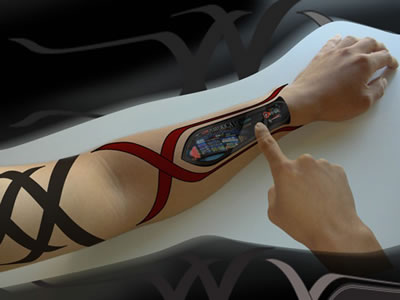
I do think these new ways of paying for things are a fascinating example of how we are further de-materializing and abstracting money into something that is more akin to electrical signals than cold hard cash. New apps like Venmo allow you to send money to your friends via an iPhone app (and is also, apparently, easy to hack!). Facebook lets you do the same thing. Of course, there’s now Apple Pay on the iPhone 6 (and you can use it on overpriced groceries at Whole Foods!). A few years back when I was traveling to West Africa, I was really interested in the ways cell phone technology was being appropriated in original ways – one of which was sending money from your phone. Back in Fall 2008 that was deemed totally radical. Funny, how this specific example of the easy of transferring money came right before the stock market crash brought on by those great masters of invisible money down in Wall Street. Being a capitalist society, I’m curious how ways for paying for things will continue to become “easier” and more integrated into ourselves. We’ve gone from cash, to credit cards, to using our phones – how soon will it be that identity and communication technology is stored on or within our person and we can pay for things with the snap of a finger?
